One of the things I love most about the nature of my studio is the rich diversity of animation styles. Even during my studies, I really liked exploring different animation techniques, trying things I hadn’t seen before (like, for example, a film made of broken glass, an attempt to create stained glass in animation. A film made of peanut butter, after which I didn’t eat a banana for about six months, and other crazy things).
Stop-motion animation essentially allows us to build a world from any material that comes to mind, and turn it into something living and breathing that tells a story. Not least, the material itself contributes greatly to conveying the message in a unique and striking way.
When the charming advertising agency Punia approached us to create a promotional video for an innovative KKL-JNF project, it was clear to both parties that we had an opportunity to present something new, refreshing, and unique. Something that would lighten the heaviness that sometimes accompanies such videos, something that would capture the attention of a young and sharp audience.
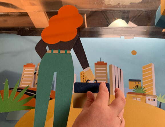
A stop-motion paper cutout video is the technique we chose to present KKL-JNF’s new plan for 2040 – Israeli relocation.
So how did we do it?

First of all – the script. We had to lighten the heavy script, and go for a lighter and “friendlier” language. With the help of our stunning narrator, Ofer, we worked on tone and texts that would resonate with a young audience and not bore them. In the “What Do You See?” scene, we tried to revive the concept of thriving cities in the Negev and Galilee through a wilderness within which houses, buildings, trees, and new settlements suddenly “grow.”


It took us a whole week to cut, paste, and prepare all the characters, backgrounds, and props for the animation. We carefully chose the colors of the pages to match our color palette. Every little part of the film is glued by hand. We discovered that the work is more efficient if we use tweezers, double-sided tape, and special glues that dry quickly and leave no marks on the paper. After the craft work, when all the art was ready and spread out before us, it was time to set up a camera and frame it.
In order to create the illusion that the houses/buildings are growing on their own, we created sets of 5 houses of each model, and each time we cut out a piece of the house until it disappeared. We ran the film itself in reverse, so that you actually see houses growing and appearing.


